
Cafe Recharge
An open kitchen for sharing the experience of Food & Family
CONCEPT
Cafe Recharge is going to be the heart of its community. Bring people together, and using the sharing of food as a method of doing so. Our research suggested isolation and financial insecurity are the reoccurring themes within the target market of those suffering from food poverty. Due to this, we wanted to design a space that really strengthened the local community by encouraging communication and interaction, whilst also creating an environment with a homey level of comfort and familiarity in order to help eliminate any insecurities people may have about approaching a food bank, asking for help, sparking up conversations with strangers, making these connections that can be so influential in improving someone's circumstances.
In likeness, as the heart of the home, the kitchen table captures the history of a family throughout the years as they share food and stories over breakfast, lunch, and dinner; strengthening familial bonds through the ups and downs of family life. Inspired by this we came up with the statement, “Cafe Recharge: An open kitchen for sharing the experience of food and family.” To us this captures the concept of designing a family orientated space, whether that’s through blood relation or the family you make through connections.
We called our concept “community pantry,” partly inspired by pre-existing notions where heavily discounted food is available to the public to help those in need. To us, it more aptly represents the home-like feeling of opening cupboards and freely helping yourself. We want to remove the stigma associated with food insecurity by offering to everyone and not isolating any one group of people.
MATERIAL
We’ve developed a rustic and quite earthy and humble palette. We’re using lots of reclaimed and upcycled materials to really focus on the sustainability and budget priorities the client asked for. We used black and white check ceramic floor tiles as they’re a timeless staple that is charming and both elegant and modest. We’re really pushing for a comforting and welcoming interior that utilises warm tones and textures to achieve that. Yellow and white block patterned wallpaper is our accent colour that brings a youthful energy to the space, adding that bright pop of colour.
FLOORPLAN KEY:
Service Counter
Retail Area
Community Pantry
Cafe Seating
Flexi-Space
Balcony
Toilets
Kitchen
Storage Room
FLOORPLAN & SECTIONS
We’ve divided our interior up into 5 main areas. The service counter, the eco-shop in front, the pantry on the front-left raised area, the book nook directly behind that with the workstation area, followed by the main cafe seating area and external balcony behind. We’ve proposed a flexible interior that can be met on a budget and also adapt into a more social and interaction-orientated layout post-COVID. We’ve balanced the dark tones of rustic materials like wood, steel and plants, with bright walls and sanded painted reclaimed cladding to create a humble and welcoming interior.
ALTERNATIVE FLOORPLANS
We’ve included an alternative floorplan layout. This floorplan is suited for after the Coronavirus pandemic when social distancing isn’t necessary. As you can see more benches are included as this caters more to our concept, and the entrance area could be utilised as additional cafe seating when circulation is less restricted.
ENTRANCE
We wanted to make a statement on entry to the space, so we’ve suggested painting the ceiling with Epoxy Resin to reflect the surface below in a high gloss beautiful finish. As you can see it immediately opens up the space creating this expanse of light and space. It’s a fairly inexpensive way to drastically impact the interior to this scale.
We wanted to play with feelings of discovery and triggering those emotional responses in the customers by having super tall repetitive shelving accompanied by ladders.
Inspired by basket texture and our choice of flooring, we’ve repeated the same cross pattern within our eco-shop shelving units, behind-the-counter shelving, and within our steel-frame suspended grid ceiling.
SERVICE COUNTER
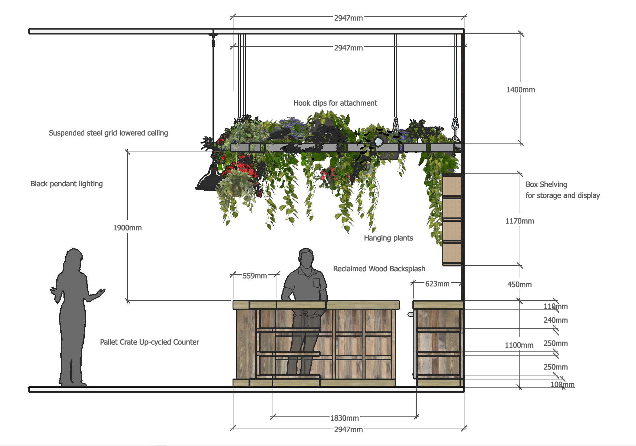
We’ve used reclaimed wood for the facade of the pre-existing bar counter. Reclaimed wood paneling runs down the entire upper half of that right-hand wall. We’ve included a cafe seating option on this level to allow wheelchair users to experience the cafe too. It was important for us to have plants hung from our ceiling grid as it adds much-needed texture and colour balance. Plants also have many positive properties that benefit wellbeing and indoor air quality.
COMMUNITY PANTRY
The community pantry and eco-shop shelving units could be used for easy access to free or heavily discounted products, such as 10 items for £3, or as additional display storage for the pantry, shown behind on the rear wall.
These visuals of our community pantry show how with even a small volume of product the dynamic shelving unit creates a curious and thought-provoking interior aesthetic. The ladders and shelving stretch up to the ceiling, towering over the user to hopefully spark youthful feelings of nostalgic play.
CAFE SPACE
We dedicated our largest raised area to our cafe seating. Our reclaimed wooden furniture is complimented by another plant-clad suspended ceiling. By lowering the ceiling we’re creating a more intimate experience.
Bringing in green tones to compliment our natural material palette. The benches can be rotated and joined post-COVID to steer towards our concept of interactive conversation through approachability.
FLEXI-SPACE
We wanted this space to be bright and youthful. It was important for us to include furniture that would be suitable for quiet moments, social moments and workshop gatherings. Books could be donated from locals in the community. Artwork could be by local artists and used as a way to promote their work and spark conversation and connections within the community.
BALCONY
The balcony provided us with the opportunity to feature a small “community garden” via a wall-mounted up-cycled pallet planter and plant boxes that simple veg could be grown in. The customers would get to see firsthand vegetables growing and see that translated into the food prepared on-site. Vertical gardens add texture to the brick wall and create a unique backdrop for outdoor seating.
This coupled with draping lights and the view could create a very “instagrammable” setting. Not to mention a cosy and inviting atmosphere for conversation and connections to be made into the evening. The balcony is covered with a glass-paneled grid shelter.
BAR DETAIL
This is a detailed drawing of our service counter showing our cladding and shelving structure.
CONCLUSION
We feel like our design captures the essence of what Cafe Recharge could represent; an inviting safe space for people to socialise and make connections regardless of background, income, or circumstance. We think our concept has the potential to make a lasting statement in the Galashiels community and for the Pay-What-You-Can System to become an example for other business models to be inspired by.
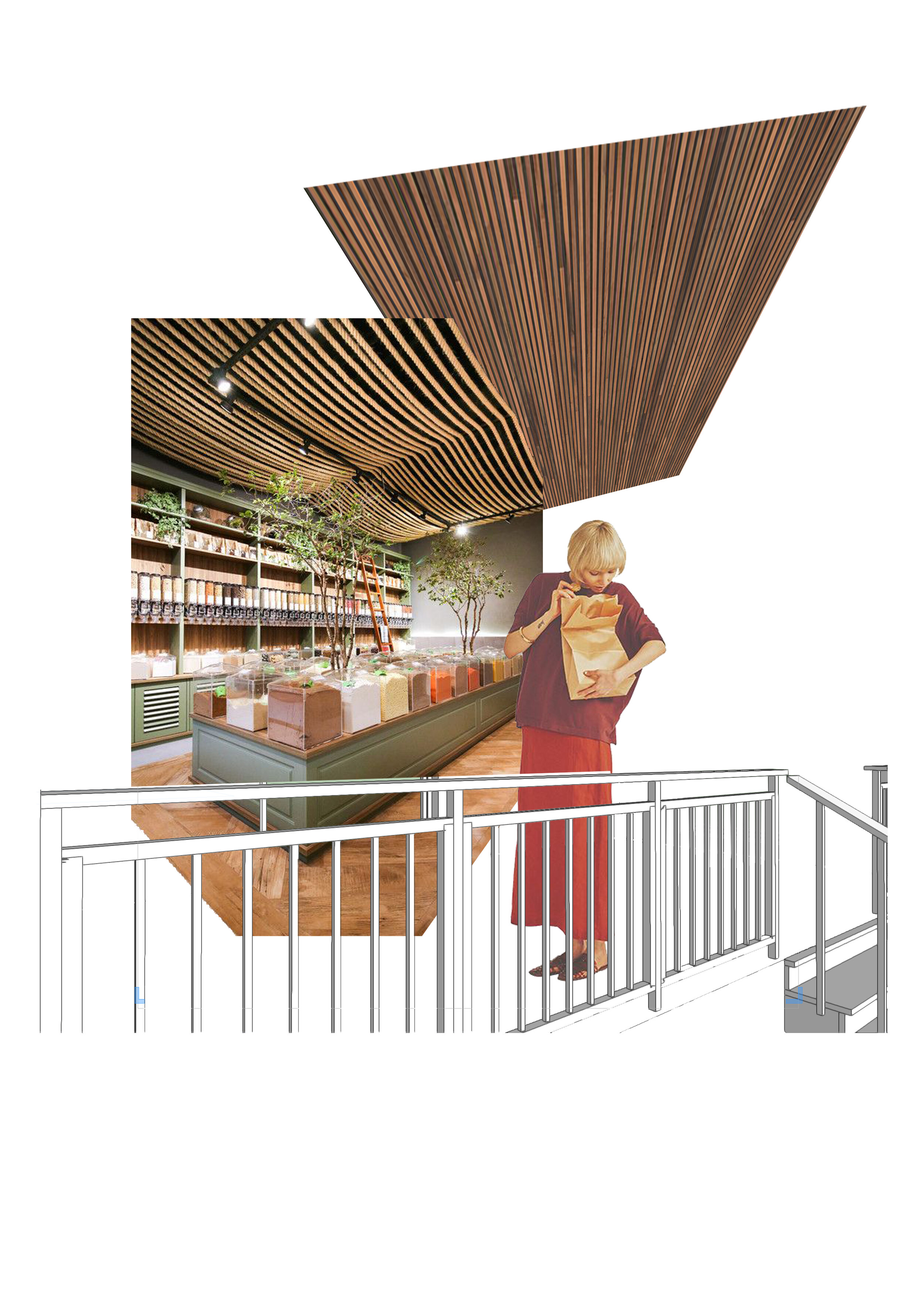
Community Pantry Collage Development
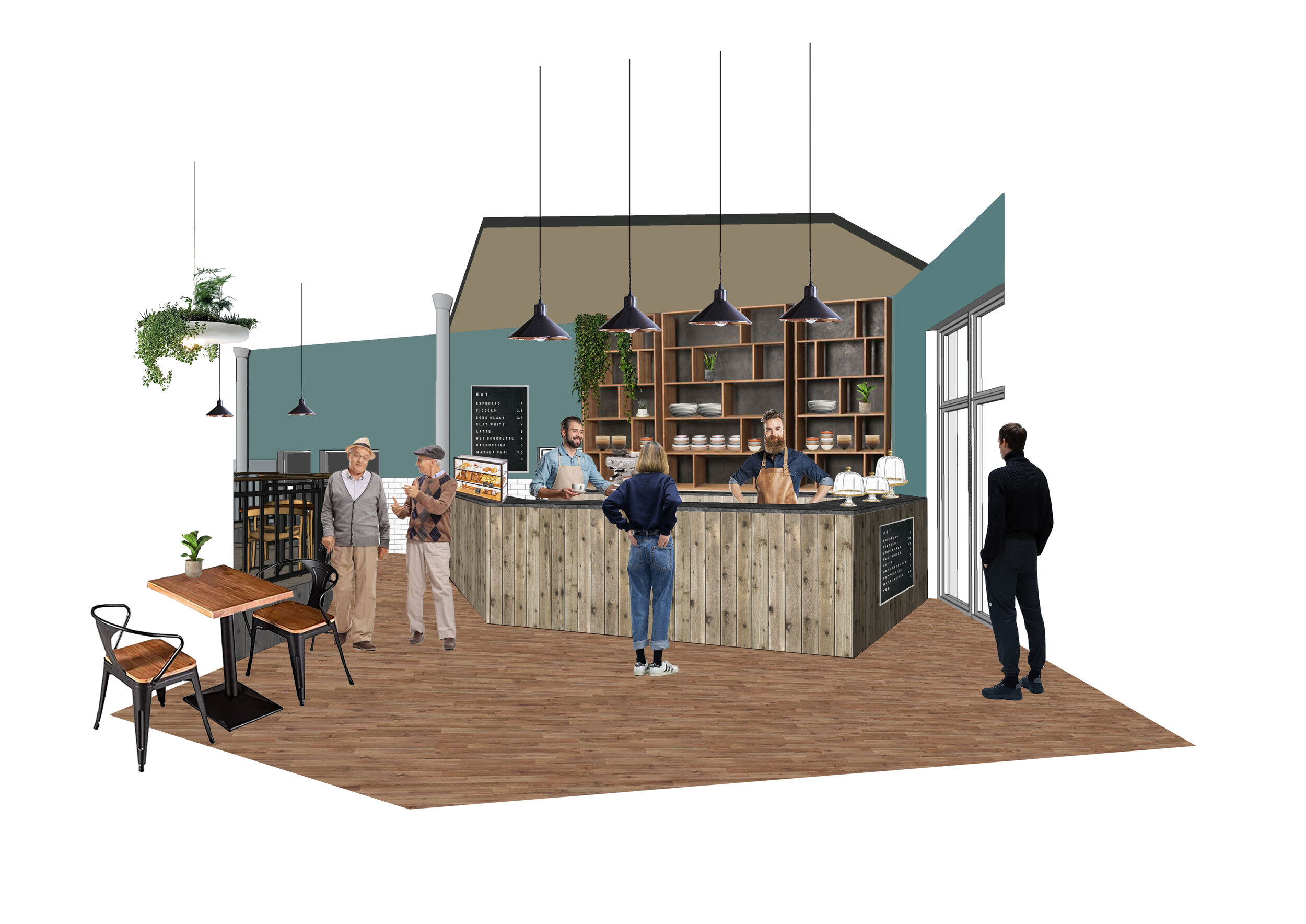
Service Counter Collage Development
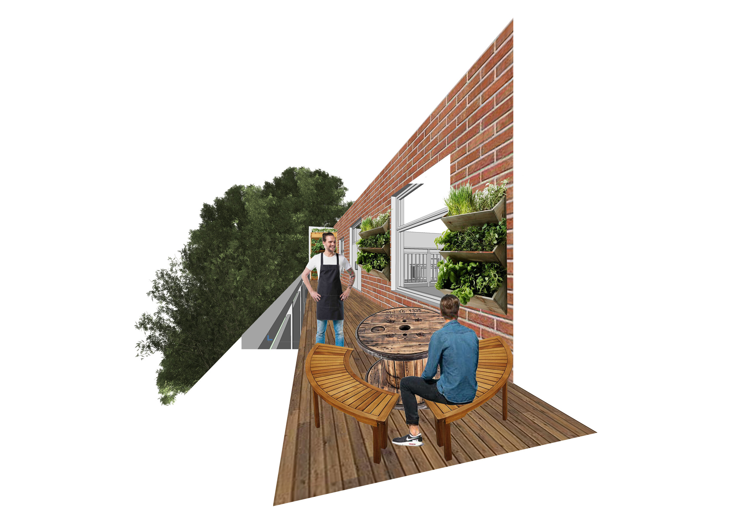
Balcony Collage Development

Flexi-Space Collage Development
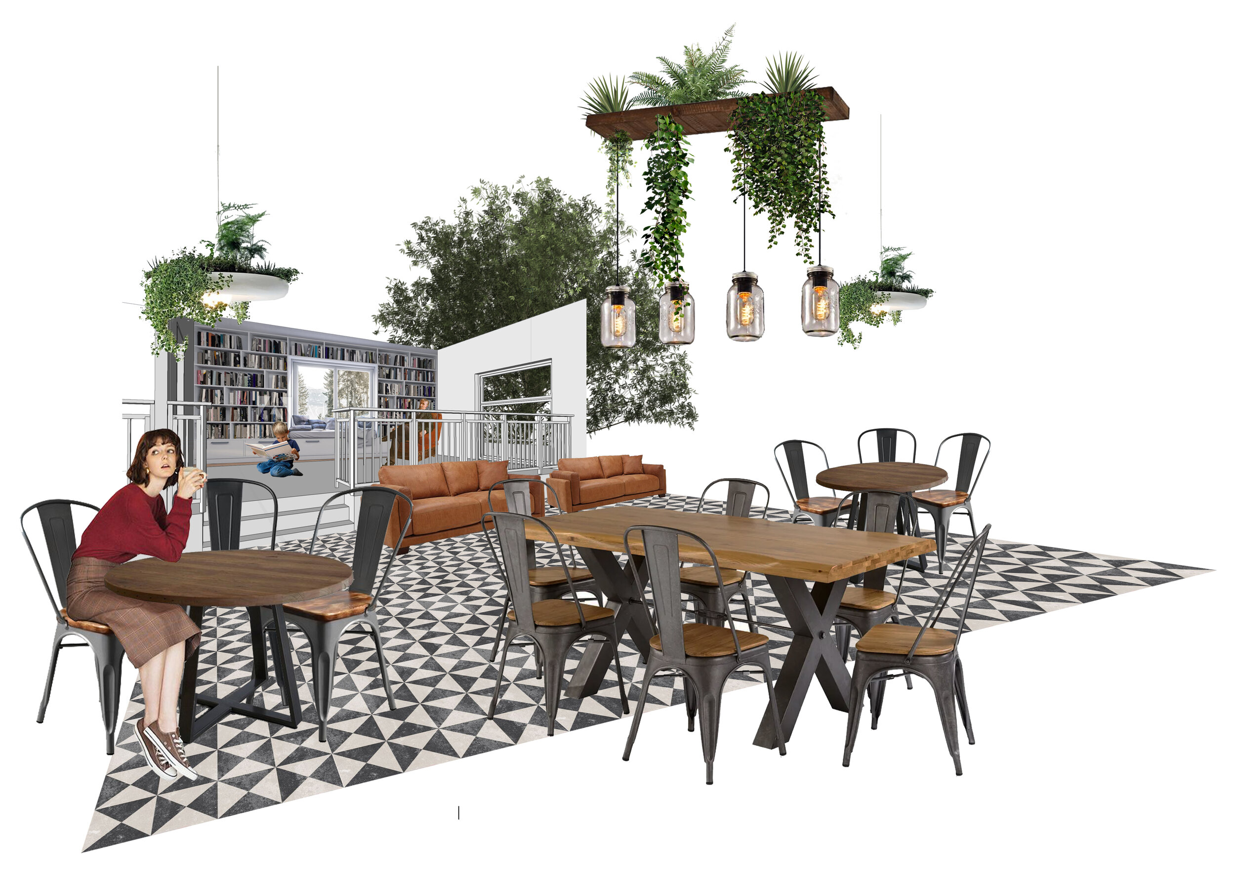
Cafe Seating Collage Development
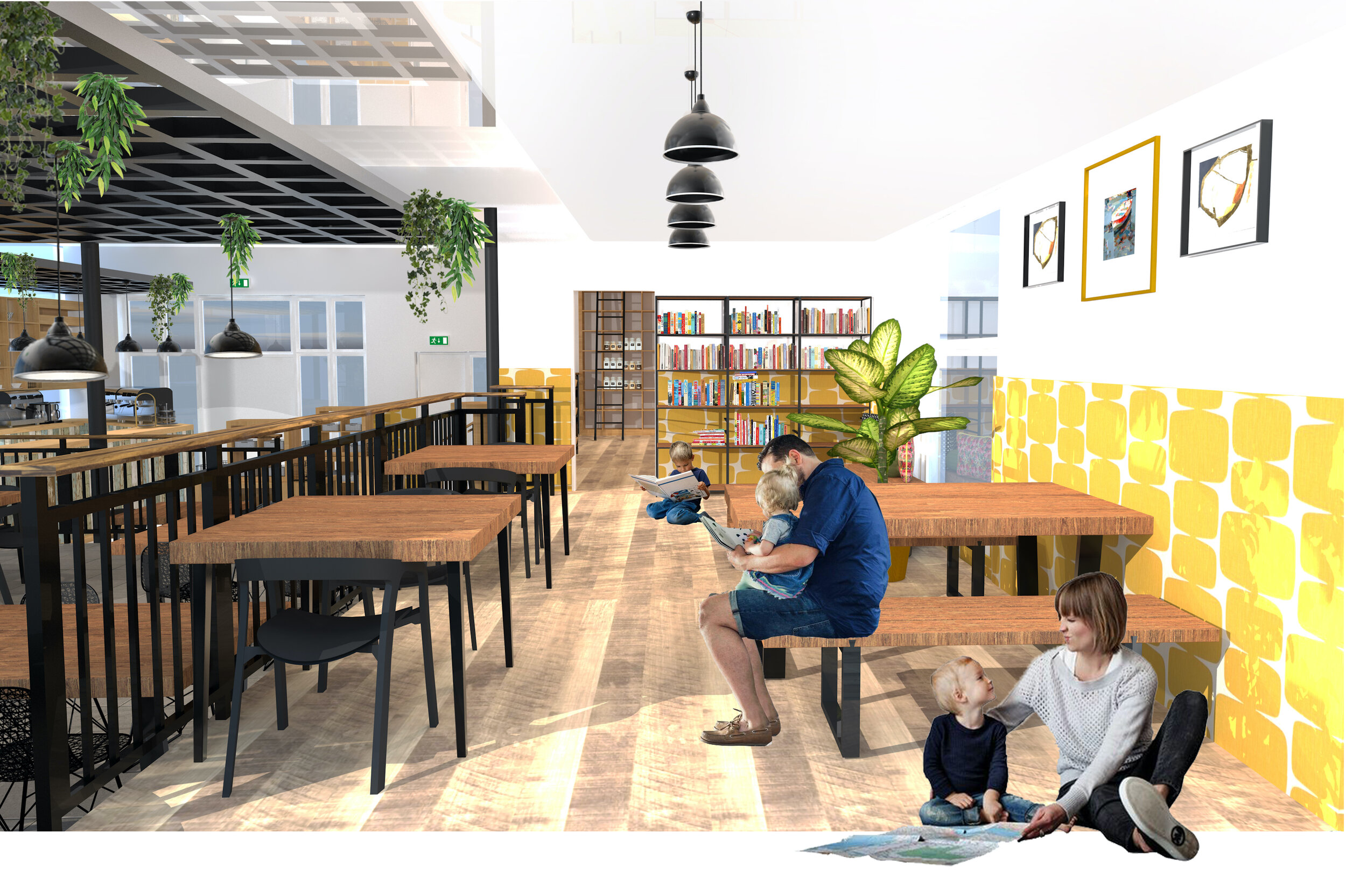
Flexi-Space

Section B-B
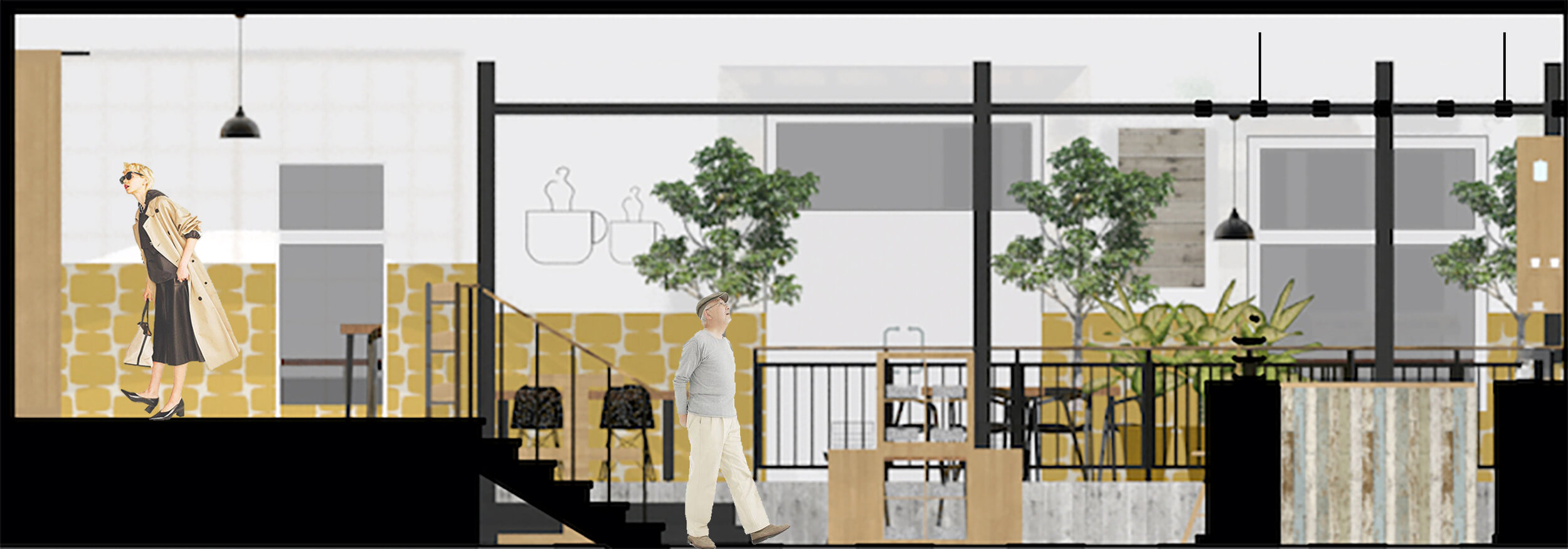
Section C-C
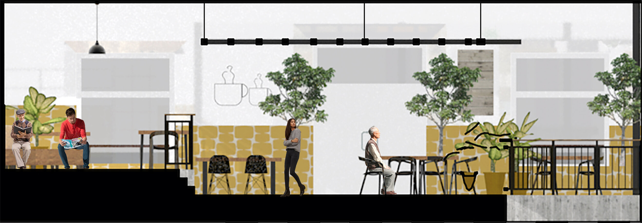
Section D-D
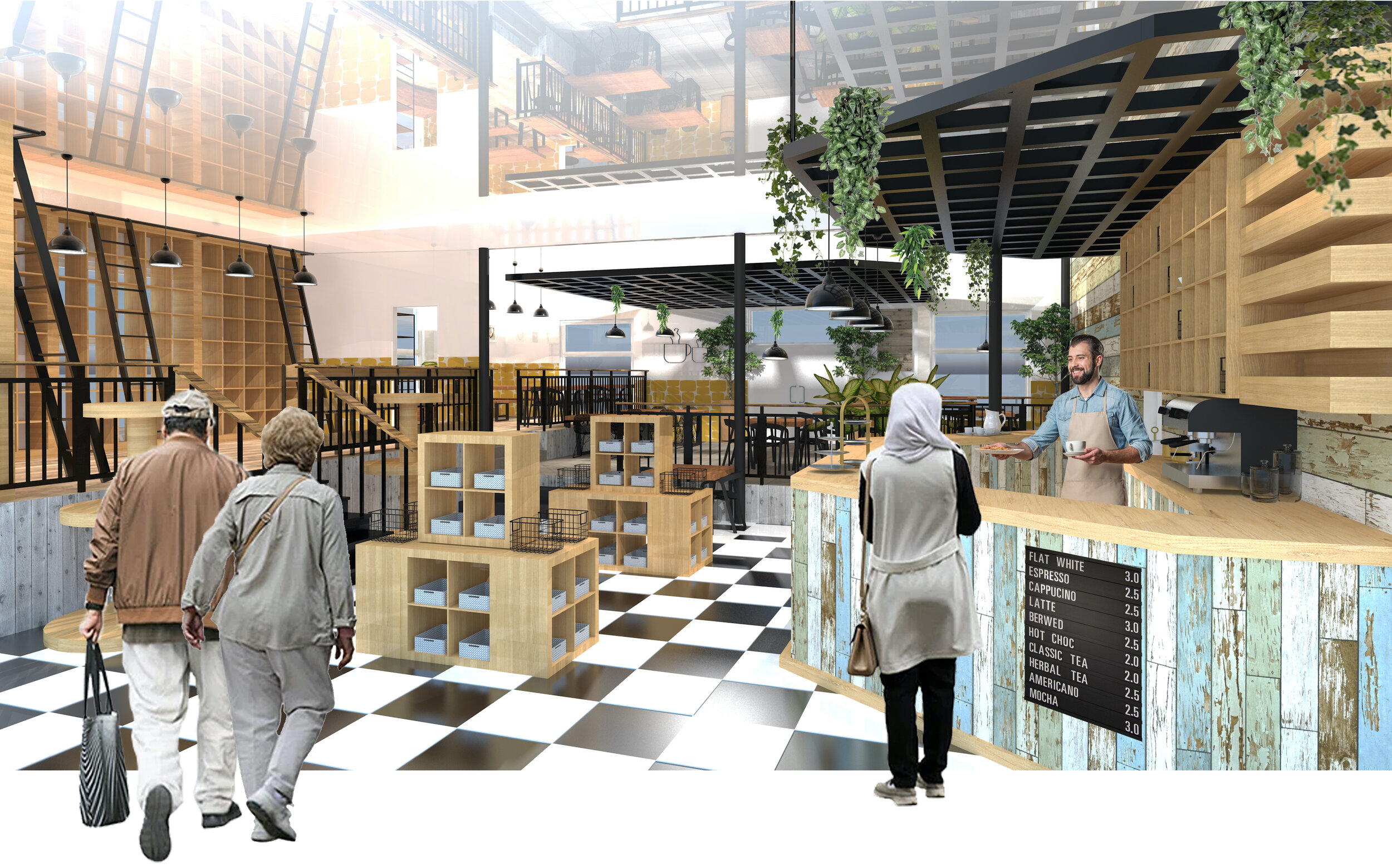
View From Entrance
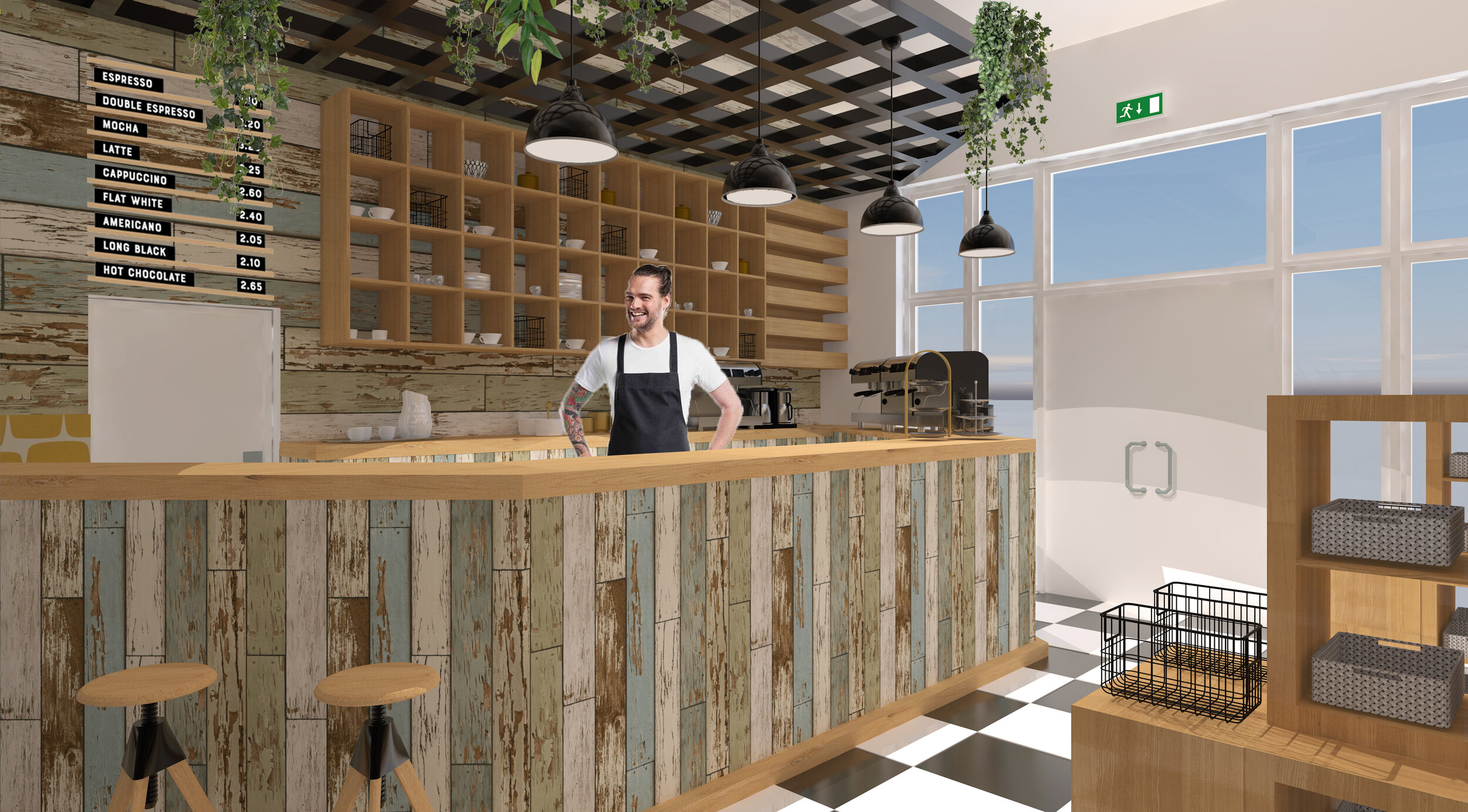
View Of Service Bar
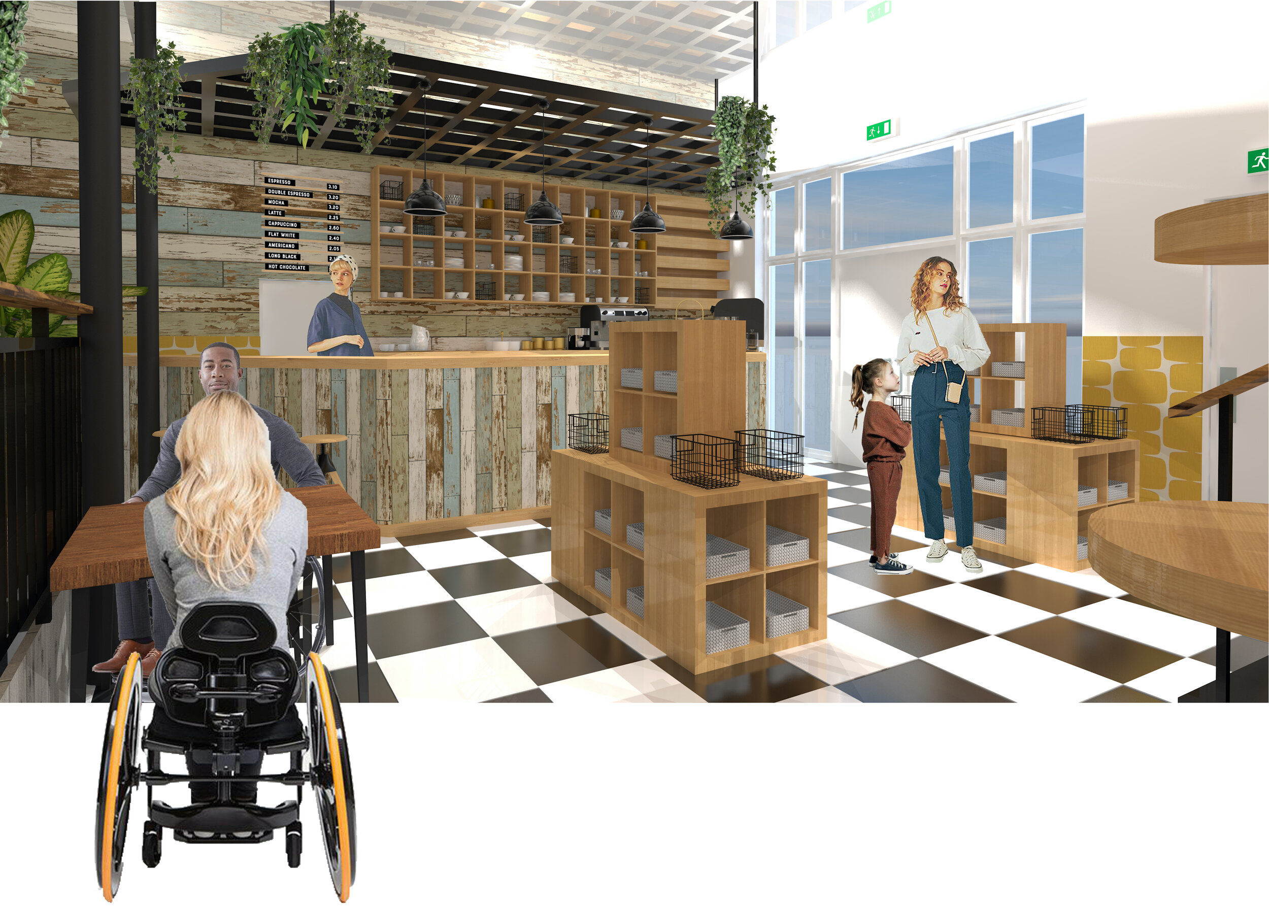
Retail Area
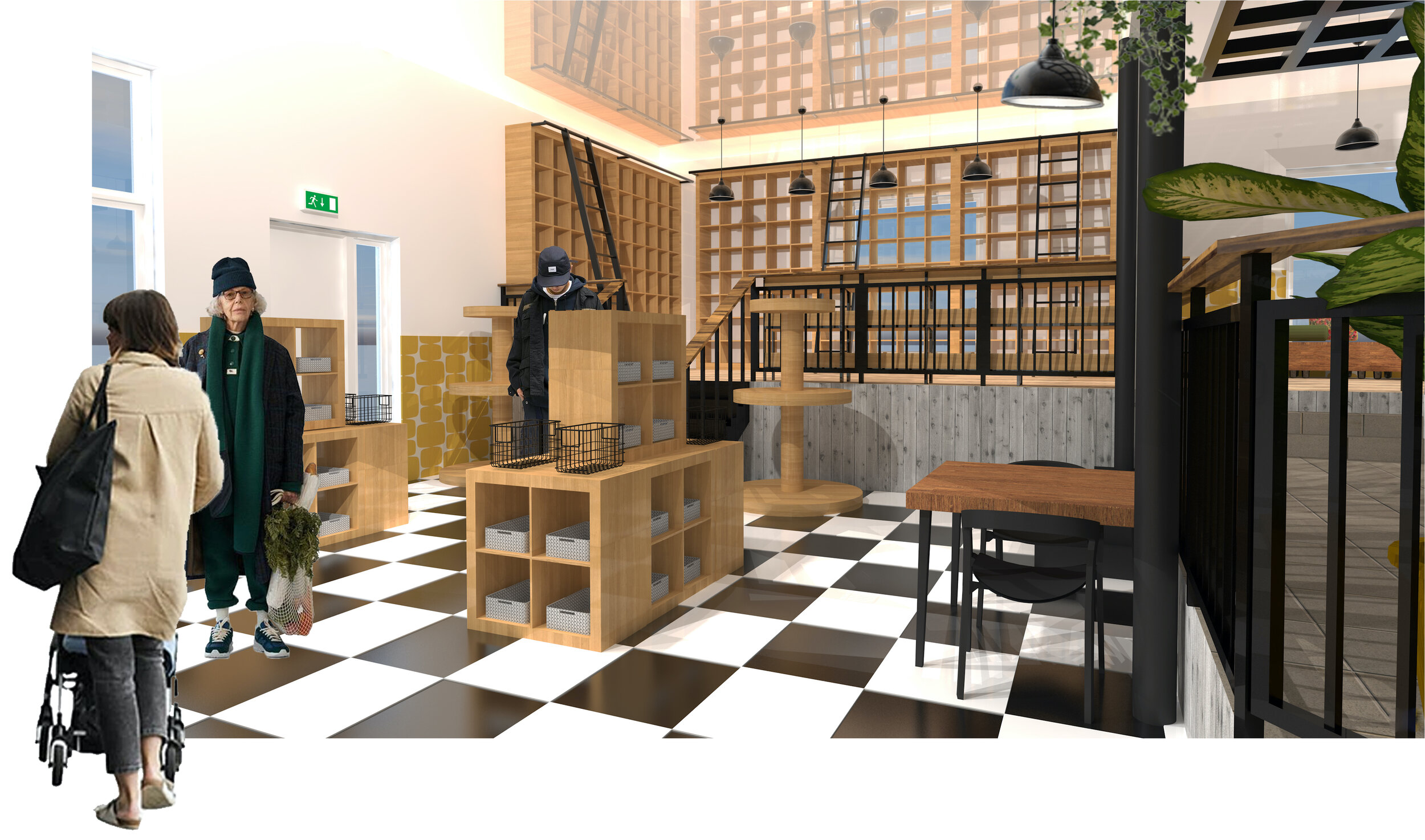
Front Area
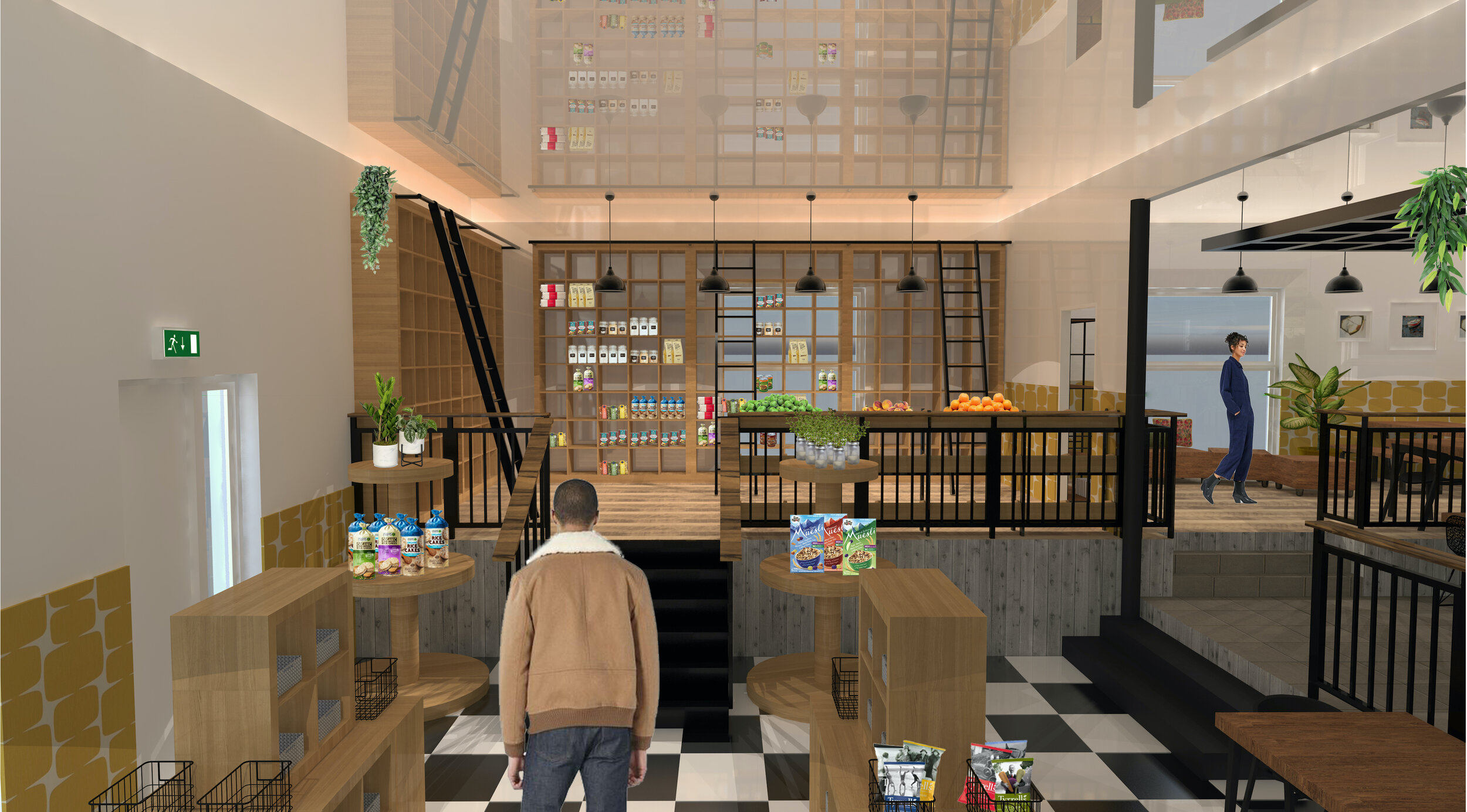
Community Pantry
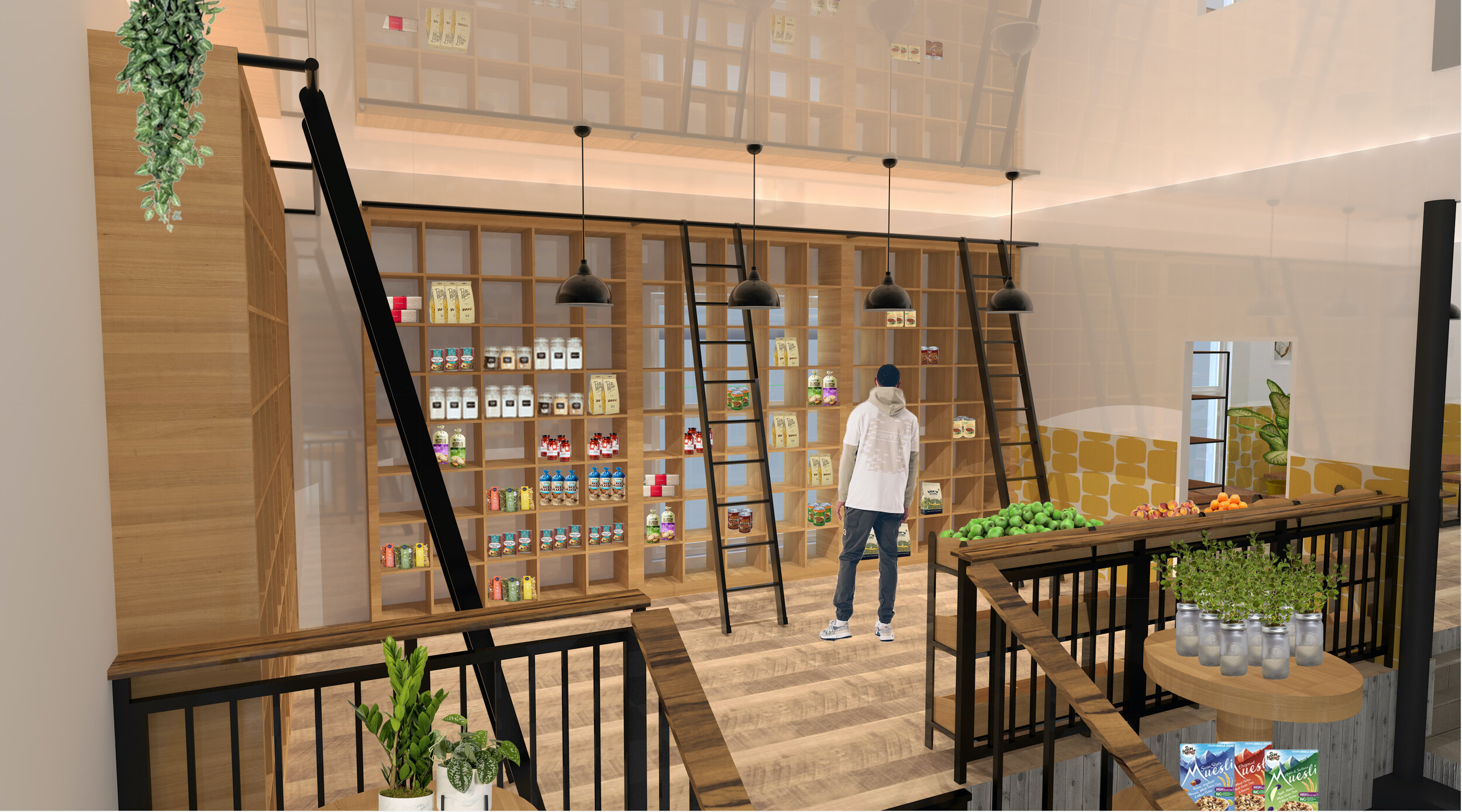
Community Pantry
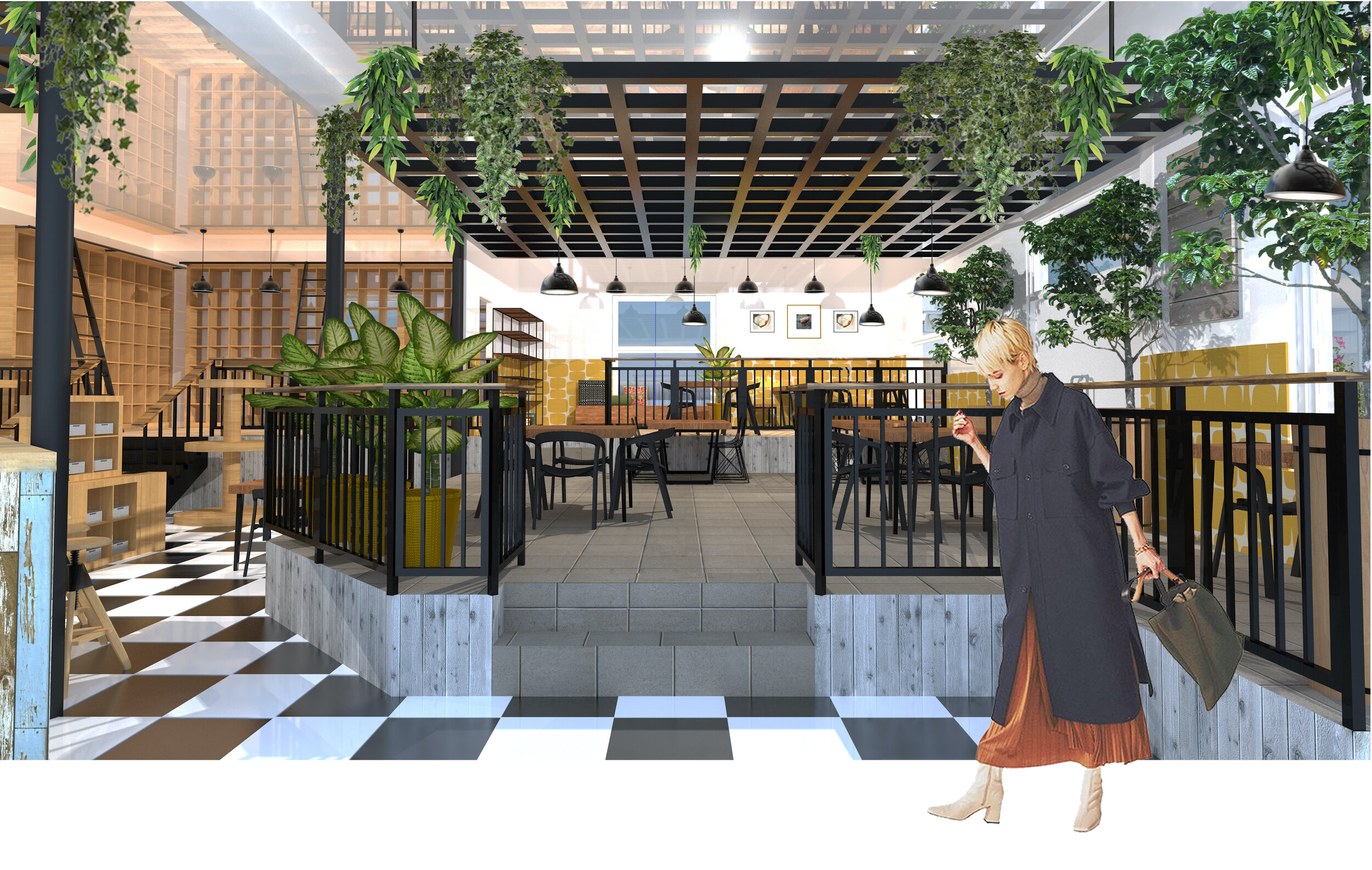
Cafe Space
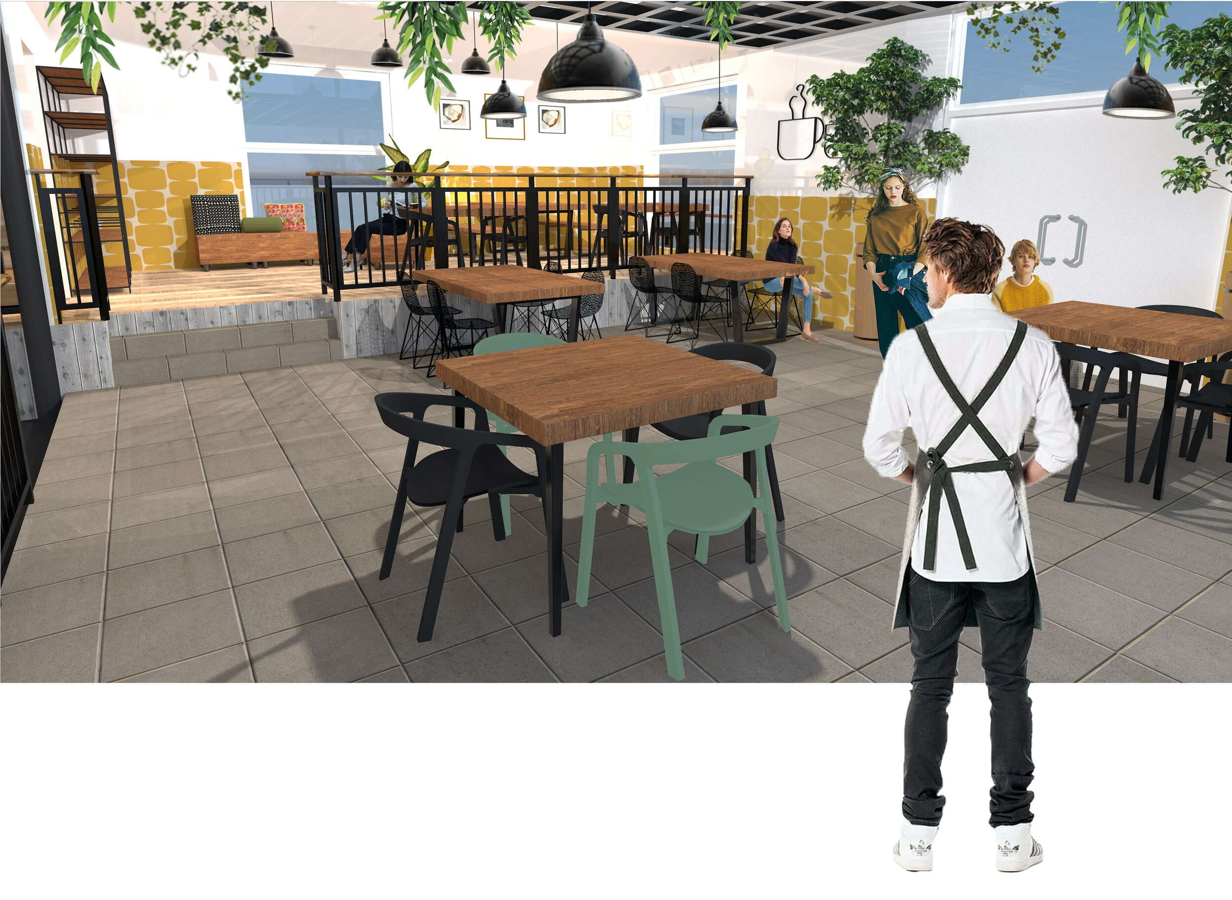
Cafe Area

Section A-A

Balcony
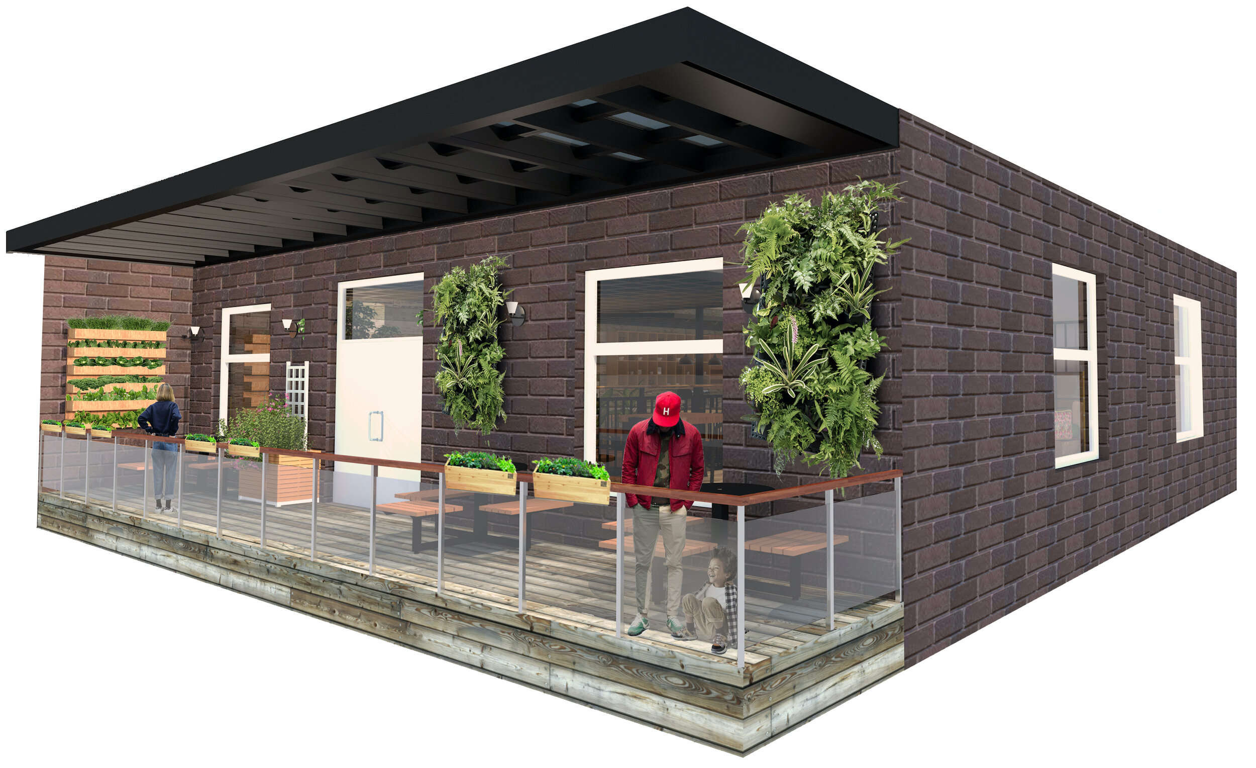
Balcony

Plan

POST-COVID Alternative Floorplan

Final Floor Plan
Detail Drawing

Service Counter Model
