Heartland Of The Borders
Galashiels Community Hub
A modular three-dimensional immersive design experience that simulates the feeling of stepping into the threaded structure of fabric.
View From Entrance

Research Infographics
Journey Map and Floorplan
Reception Area
Exhibition Display
Interactive Screens and Exhibition Displays
Device Charging Area

Rear Of Space
Meet Space

Overview View From Front

Material Palette and Detail Drawing
COMMUNITY CENTRE PROJECT SUMMARY
BRIEF AND RESEARCH
The brief was to redesign the interior space of a retail outlet in Galashiels town centre into an adaptable and flexible multi-purpose community space.
We began by creating a detailed site and location analysis.
We asked ourselves, who uses a community centre? What is its purpose? And how can we engage the locals of Galashiels in this space for it to become a thriving place of gathering for people who need it. We concluded that the interior has to provide a sense of security, comfort, permanence, and fun, which are qualities we’ve incorporated in our design today.
To design for any client it’s vital to understand the location in which you are designing for. So this meant fully understanding the needs and requirements of the brief. We’ve highlighted the main requirements in the second banner here.
In order for our community hub to be successful it has to engage its users, and be as attractive, informative and useful as possible, so basically a multi-functional and contemporary interior. It also had to cater to the modern-day person. As technology becomes more accessible and integrated into every aspect of our lives, this creates an opportunity for public spaces to implement technology in a way to bring in more people and give the impression of being a modern, forward-thinking space.
The design also had to be modular, flexible and storable to allow it to adapt to the non-permanence and ever-changing needs the site may experience as a rented space, whilst also celebrating Gala’s rich history and people.
We also conducted an online survey to analyse the public opinion of community centres. This proved beneficial in highlighting what facilities should be included. Over 55% of our survey responders said they had never taken advantage of community centre services, but 79% stated they’d use a community hub for events or business promotion, and the high majority of respondents stated they’d use one for meetings, socialising, holding or attending workshops, and for clubs and recreational purposes. 79% also agreed that if the community centre was allowing pets they’d be more inclined to use it. So we bared this in mind when defining our interior.
This last infographic shows features we’ve implemented throughout our design which highlights how our site will connect to other communities, outside interventions we have considered, how our site aims to attract returning visitors, and what our site offers to the community of Galashiels.
CONCEPT
Inspired by the complex relationships between people and place, our design aims to reflect both Gala's rich textile narrative, and the spirit of the people who live, work, and travel in the Scottish Borders every year.
Using Peter Eisenman's architectural style as a catalyst for our design inspiration, we aimed to create a modular grid interior that incorporated the repetitive linear elements seen throughout the properties visible within fabric texture, form, and structure. Galashiels is a town known for its rich history in textile manufacturing and we wanted to celebrate that with a three-dimensional immersive design experience that simulated the feeling of stepping through the front doors into the threaded structure of fabric.
We wanted to emphasise the importance of connections within communities and have implemented a modular grid structure as a way of expressing this. We envision our community hub to be a colourful view in Gala's high street, by incorporating a rainbow of colour inspired by Energise Galashiels branding. To us, colour represents life, and all the magical moments and human connections we experience and share together. The rainbows being displayed throughout the Coronavirus pandemic in support of NHS workers really showed how powerful colour can be in expressing community values and uplifting spirits.
We aimed to create a colourful interior that helps to build relationships and connections between communities and their members.
JOURNEY MAP & FLOORPLAN
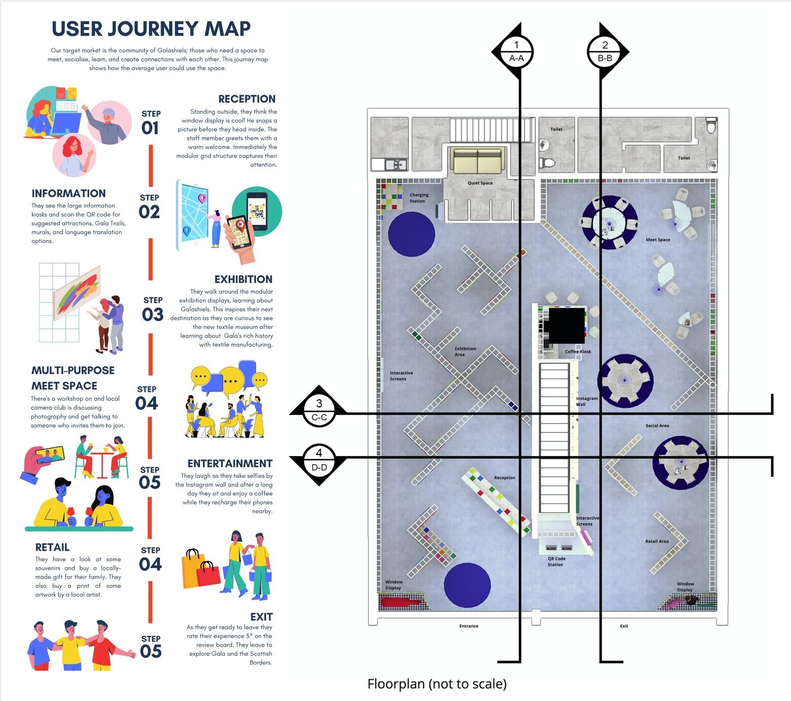
We’ve incorporated a single-direction circulation to our interior to better aid COVID social distancing, but also to provide control over the way in which people used the space. As the main pedestrian traffic was likely to come from the high street to the right we encourage the user to enter from the left entrance, after walking past the entire facade and seeing the window displays.
To create a dynamic and exciting interior floorplan we’ve taken our grid concept and rotated it 45 degrees, which naturally created pockets within our site to separate areas by function.
So we've got the reception situated by the door for immediate interaction with the staff member. Followed by the exhibition space. There’s a charging area just beyond that. At the rear of the site we then have the meet space. Situated next to that we’ve included a small coffee kiosk. There’s an instagram wall beside that. And finally we have a retail space for selling local products. And as you can see we have a grid structure fixed to the ceiling.
MATERIAL SAMPLE BOARD AND DETAIL DRAWING
As you can see we’ve used wood as a primary material, stainless steel, various colours of acrylic paneling, dogtooth pattern wallpaper, tweed fabric, colourful threads, and polishing the concrete we believe is beneath the existing tiles.
The detail drawing is of part of our modular grid structure. As you can see it consists of only 2 elements - wooden rods and steel connectors. In addition to this acrylic panels, or custom clips for securing information boards can be added.
WINDOW DISPLAY
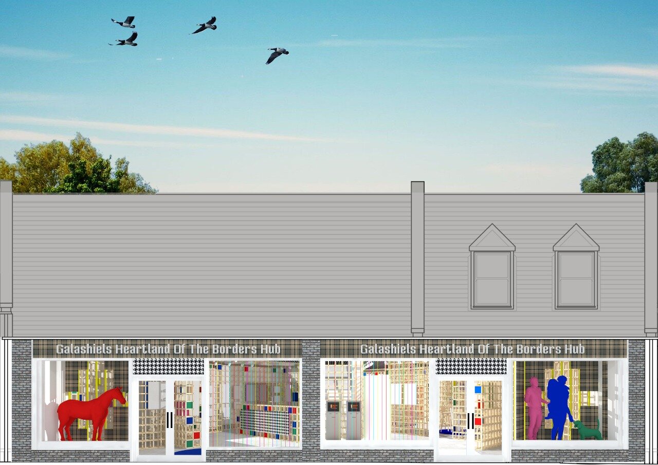
Our interior is high impact, so we wanted a simpler window display that introduces colour to Gala’s high street. We’ve used installations of a family and dog, and similarly a horse in the other window, which link to our target market and to Gala’s interest in equestrian sports. Each installation is in the foreground of large tweed fabric panels which through cut-outs shows a glimpse into the interior behind.
ENTRANCE/RECEPTION/EXHIBITION
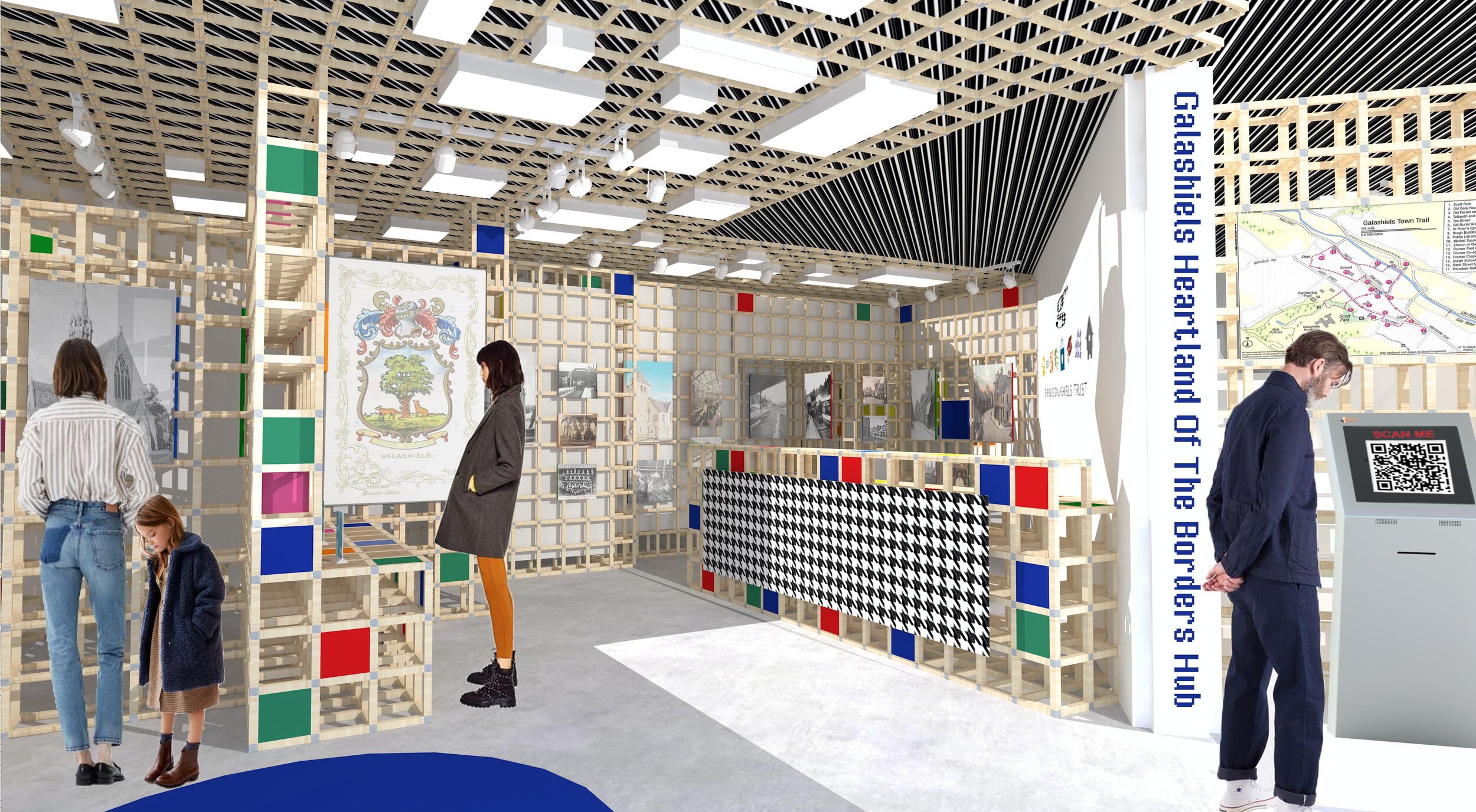
This first visual shows the view as soon as you enter the space. Immediately our three-dimensional immersive design experience that’s meant to simulate the feeling of stepping into the threaded structure of fabric, starts to become more obvious. The idea is this entirely modular structure makes an impact and provokes conversation in the town and creates a really memorable experience. We want people to come to the space, be excited by it, and want to come back, and we think this grid concept has the ability to do that.
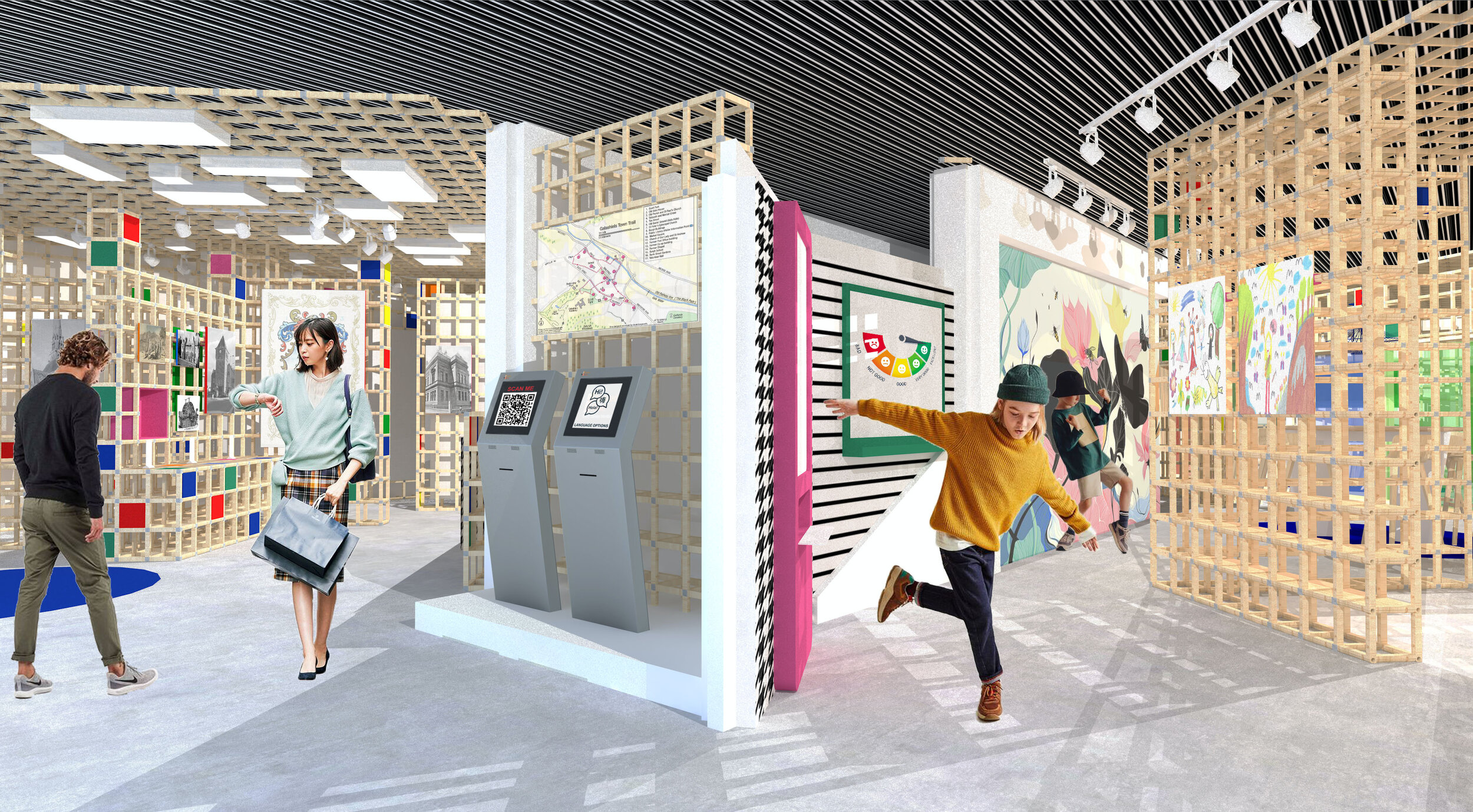
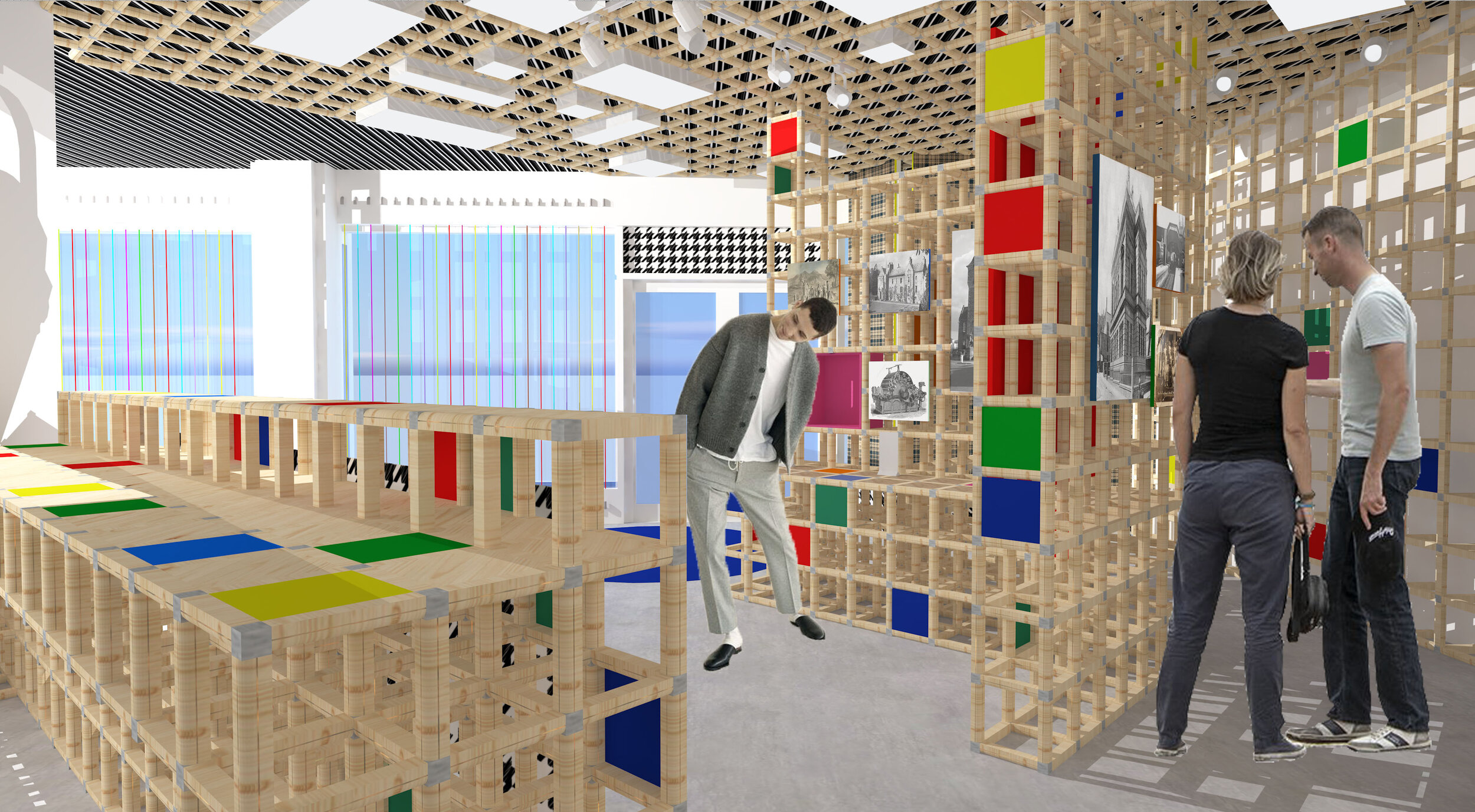
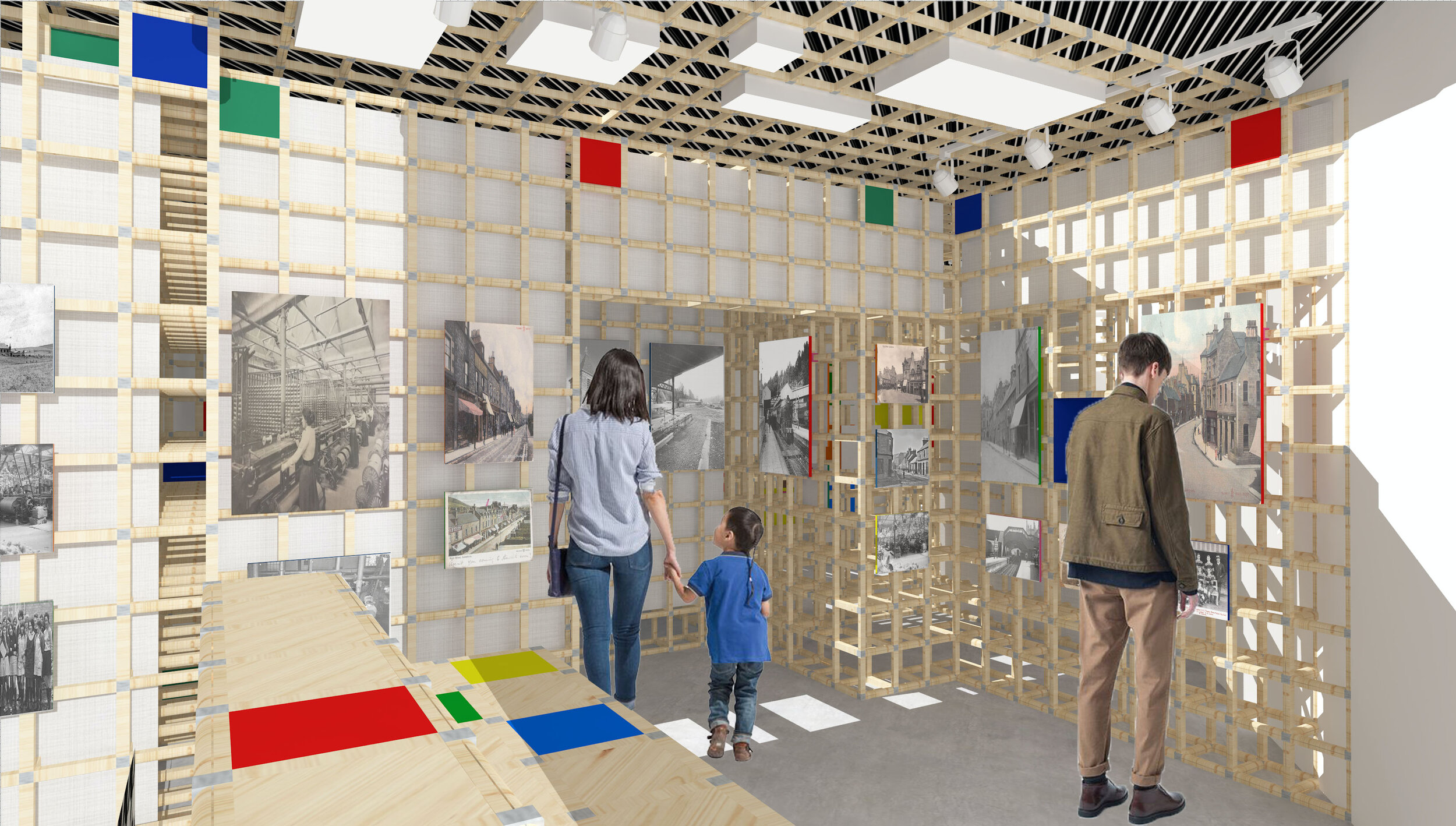
Our reception desk (built out of the same modular elements) is angled to guide the user further inside towards the exhibition space. In this area we are introduced to our small coloured panels that fit directly into our modular elements and they’re used to bring pops of colour and add another layer to our design aesthetic. Box lights fit snuggly between the grid elements and guide the user towards the exhibition displays. We’ve incorporated the dogtooth pattern seen in Energise Galashiels Trust’s logo on the ceiling and as a fabric stretched over the reception facade.
EXHIBITION SPACE
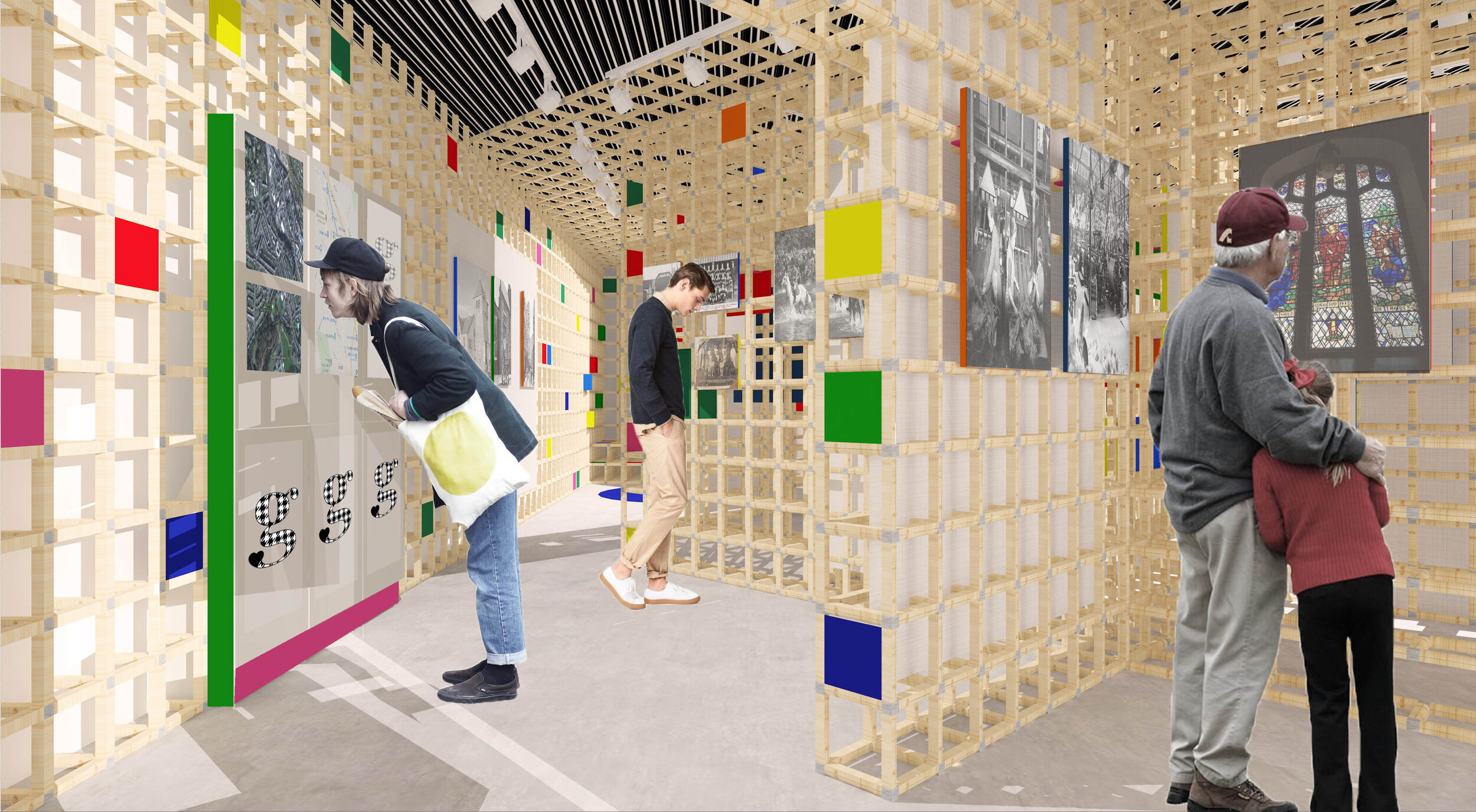
Stretching across the entirety of unit 9 is our exhibition space which features the history of Galashiels. We’ve got an infographic here showing our key areas. Images printed on canvases slotted into acrylic frames, are mounted on our grid structure. Following the pathway, the user weaves between the modular displays, learning about Gala and being immersed in the photography and information on display. The layout is designed to slow the user down, encouraging them to take in more of the space.
INTERACTIVE SCREENS
Situated on the left-hand wall wrapped in the modular grid are three interactive screens. These could be used for many functions such as displaying exhibition content, providing maps and directions, or showcasing local attractions or events.
CHARGING STATION
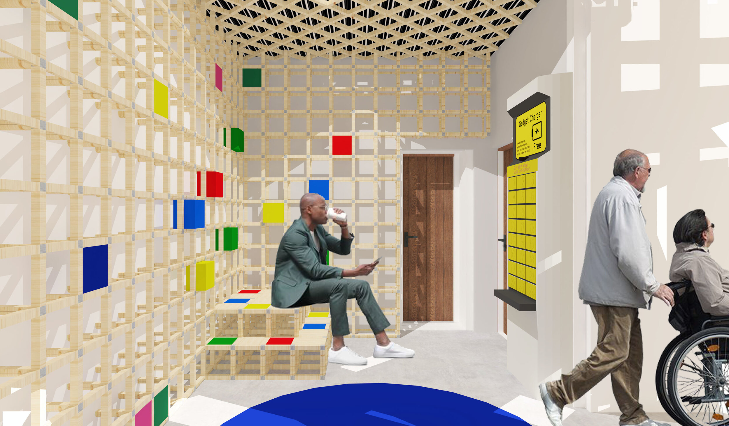
As a community space caters to a multitude of functions and types of user, this allows for phones or laptops to be charged if no other sockets are available. They can be locked inside whilst they explore the exhibition or grab a coffee. Alternatively, the grid extends out here to provide seating if someone wants to use or watch their device as its charging.
COFFEE KIOSK AND SOCIAL GATHERING TABLES
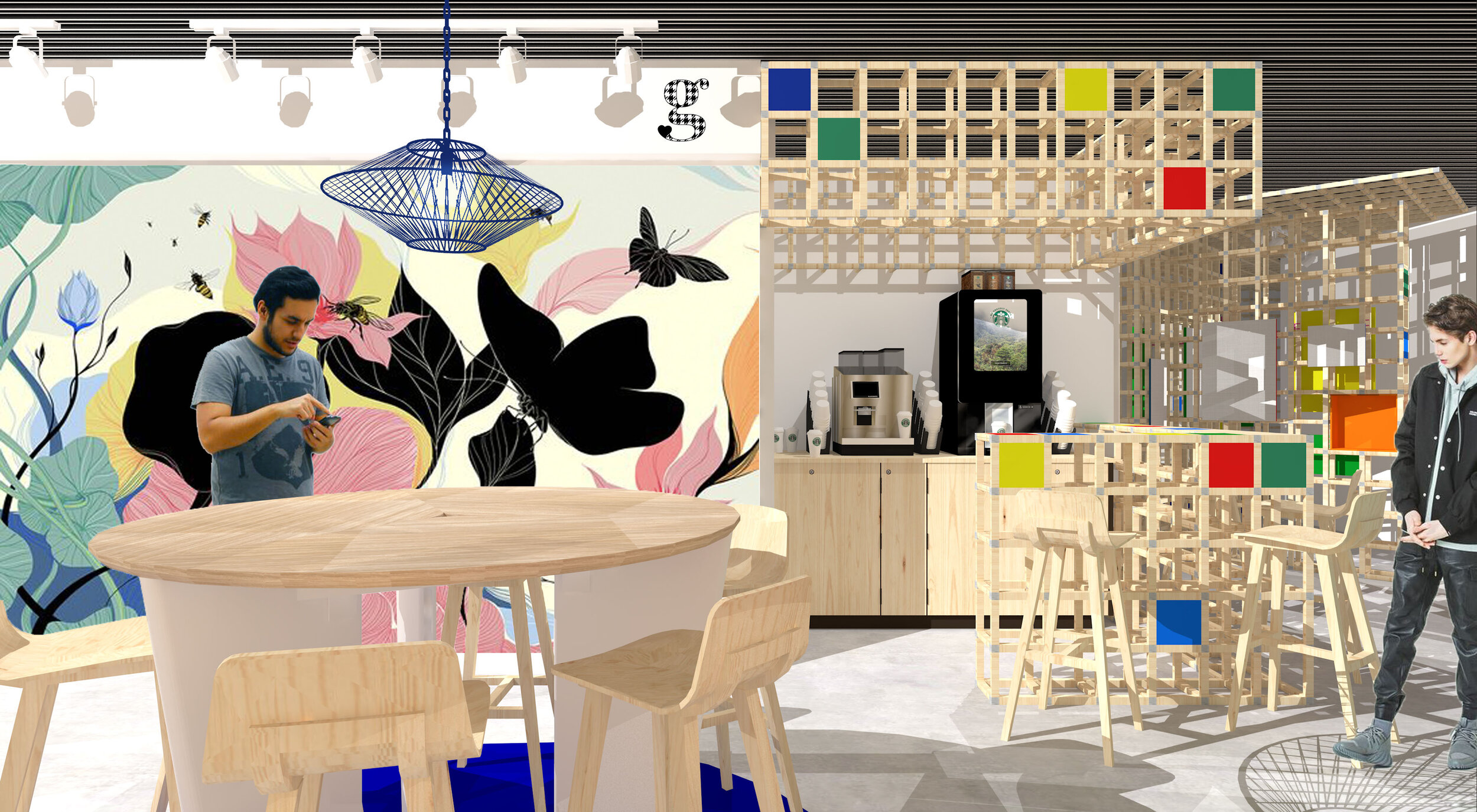
We felt a small coffee kiosk would be a much-needed addition to the space as its low-key nature would be unlikely to compete with local coffee shops, and its convenience would be ideal for those using the meeting space. We’ve enclosed the coffee area behind a modular grid bar top, to provide a surface for additional seating and for people to gather around. The grid ceiling here is lowered to create a more comfortable setting.
To promote Galashiels and provide free advertising we’ve included an Instagram wall which you can see on the left. This fun and energetic wall could be simply painted on the rear wall as an inexpensive option. We also think having it be repainted with new art every few months could encourage re-visits, especially with younger people.
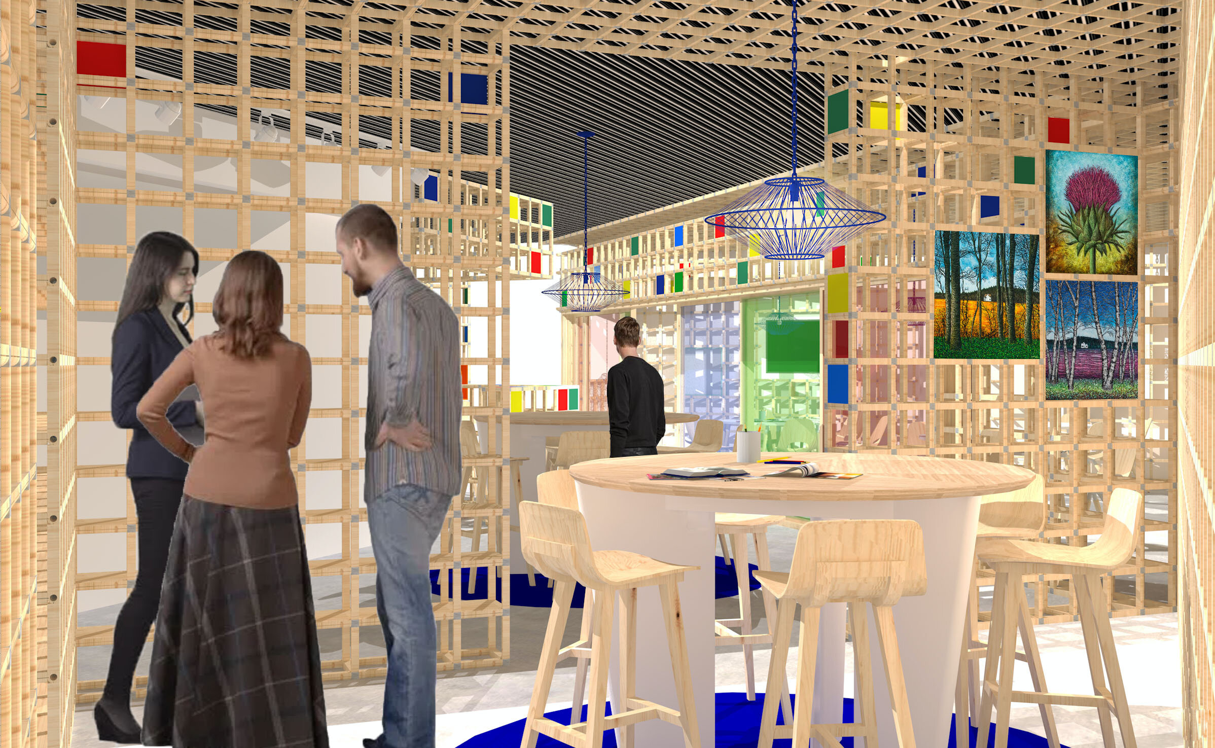
We’ve included two tall tables for more casual or independent usage. One is more open whilst the other is placed behind grid display panels to offer a more private option. These panels could be used for displaying artwork, community information, or temporary brainstorming boards.
The above visual to the right shows the open plan social tables from another angle. In this view we’ve included artwork by a local artist, Mark Sermon, displayed on the inner grid surface. We have designed these L-shaped modular grid panels to feature a small selection of books and locally made products on the other side. The proceeds could be sent back to their maker to help support local artists and businesses.
MEET SPACE
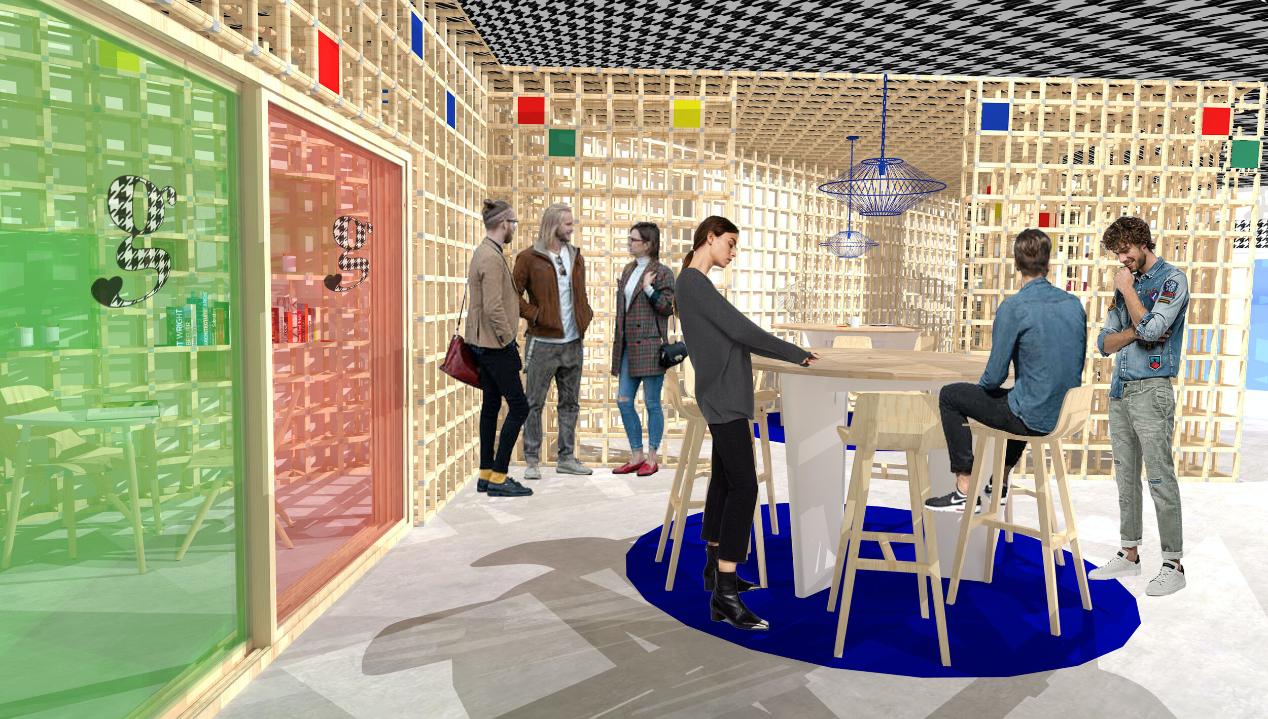
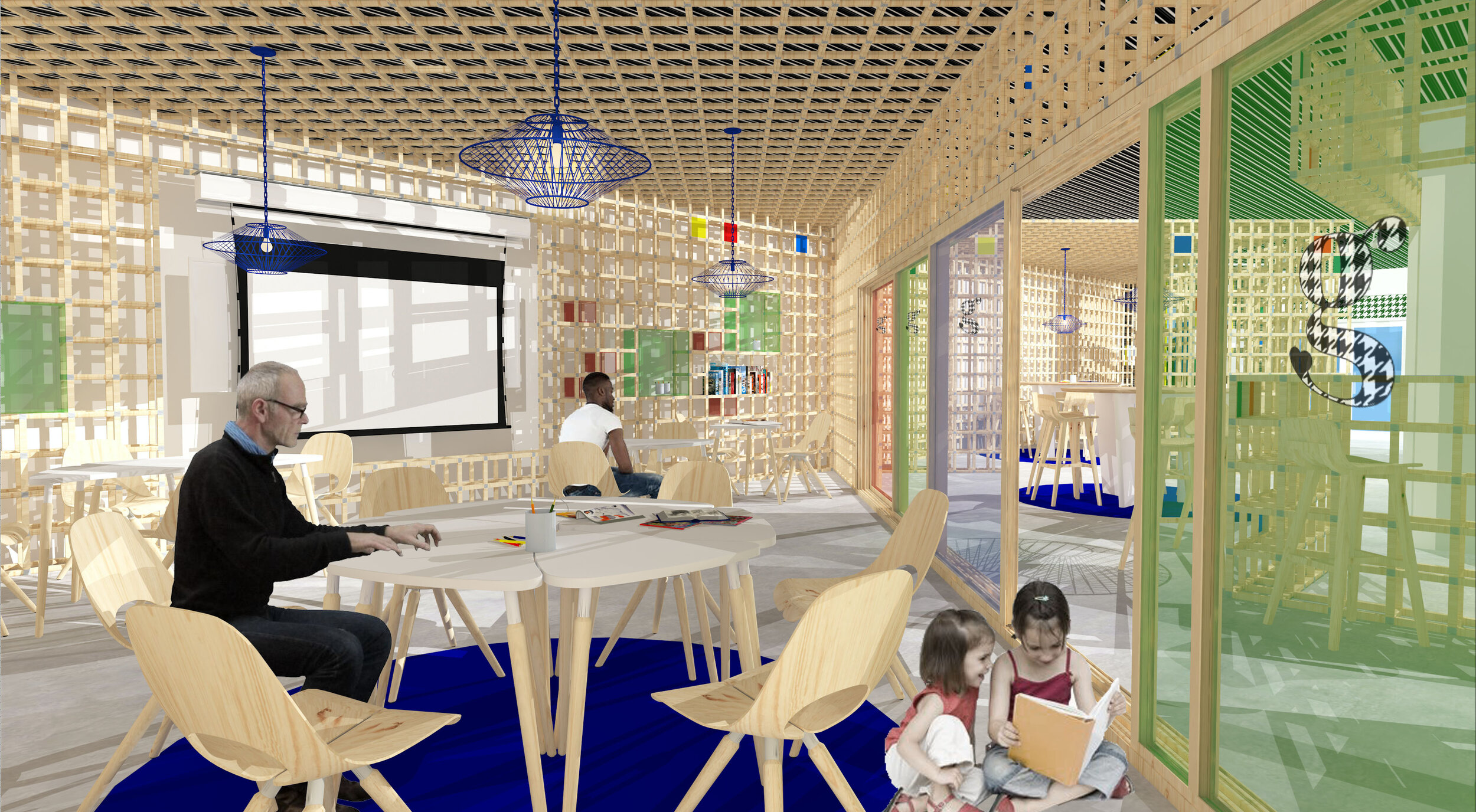
For the meeting and workshop space we've designed a flexible space that can adapt to the required use. Behind coloured glass doors, which can be pulled or pushed along their wooden frame, we have modular tables, projection screens, white boards, shelving and storage, and a TV. We also suggest that the glass panels could be utilised as an additional surface to write on.
As the modular grid can be adjusted to varying sizes, this allows for adaptable storage options.We have boxes slotted into the gaps.
We think this space would be great as a place for community meetings, a variety of workshops, clubs, or classes, for film nights, or private hire. The modular grid provides a feeling of privacy and seclusion.
OVERVIEW VISUAL
And finally, we have an overview visual showing our interior from the front. You can see our QR displays offering language translation options, or links to trails, attractions, and events. The pink and green displays seen here are interactive screens that could be used for visitors to rate their experience, or suggest ways that Galashiels could be improved. The modular grid offers interesting shadow texture which, as you can see illustrated here, is being used by a child to play on. I think little quirky details like that really bring this space to life and I can imagine people using it.
Overall we think our design would definitely create a buzz within the Galashiels community, and offer services that could create a positive impact on people, young and old, who use this space.


